This is a collection of charts, graphs, etc. that may help one visualize the current situation and/or past situations related to Covid (and other) vaccines. It is a work in progress.
From a hearing in Australia, August 4, 2023:
BOMBSHELL: Pfizer employees were given a *special batch*… different from what was forced into the general population 🚨🚨🚨 pic.twitter.com/CDww6wxFif
— Pelham (@Resist_05) August 4, 2023

Earl2006 (birth control vaccine)
Lee2020-ADE:
Antibody-dependent enhancement and SARS-CoV-2 vaccines and therapies
Dr. John Ioannidis, Prof. of Medicine & Epidemiology at Stanford created this chart.
https://med.stanford.edu/profiles/john-ioannidis
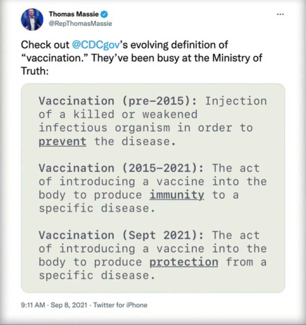
History of change in definition of the word Vaccine according to the CDC:
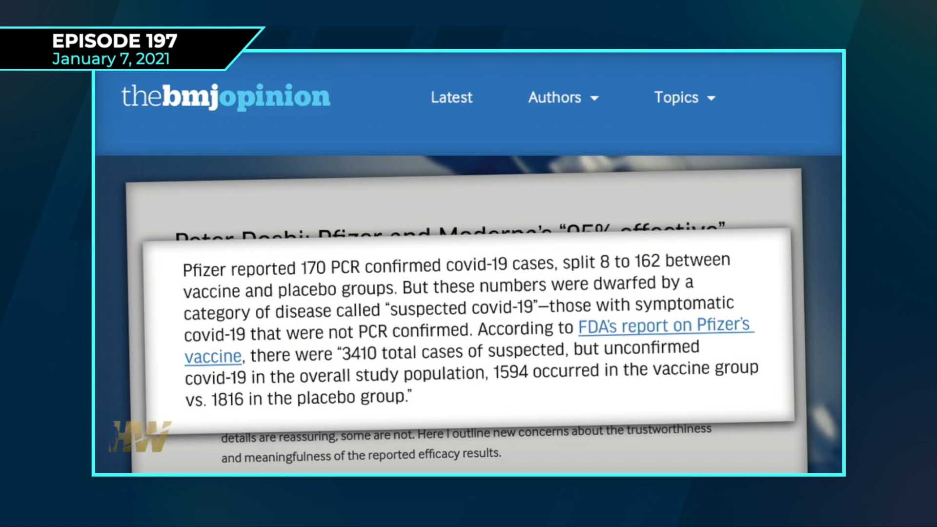
This excerpt from the British Medical Journal is discussed in Episode 197 of the Highwire. Watch it here: https://thehighwire.com/videos/science-junked-as-covid-vaccine-rollout-falters/
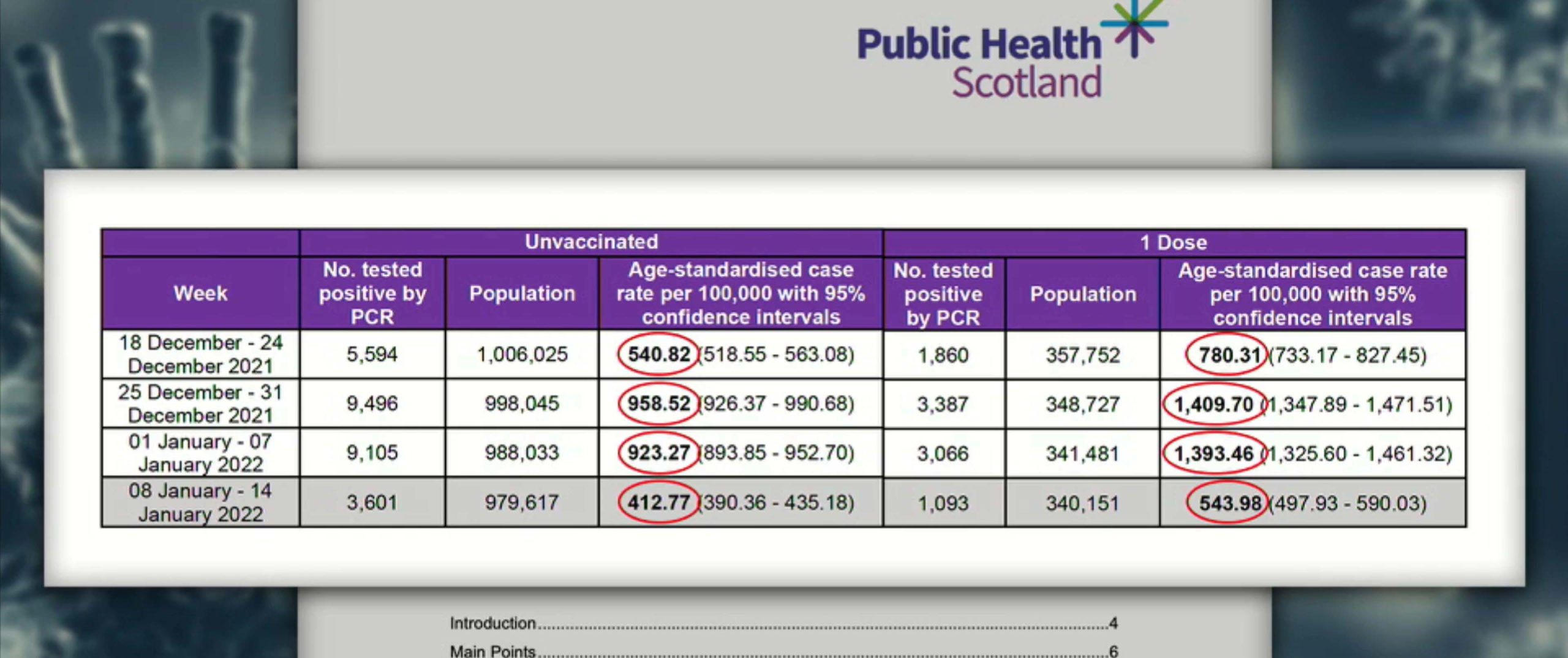
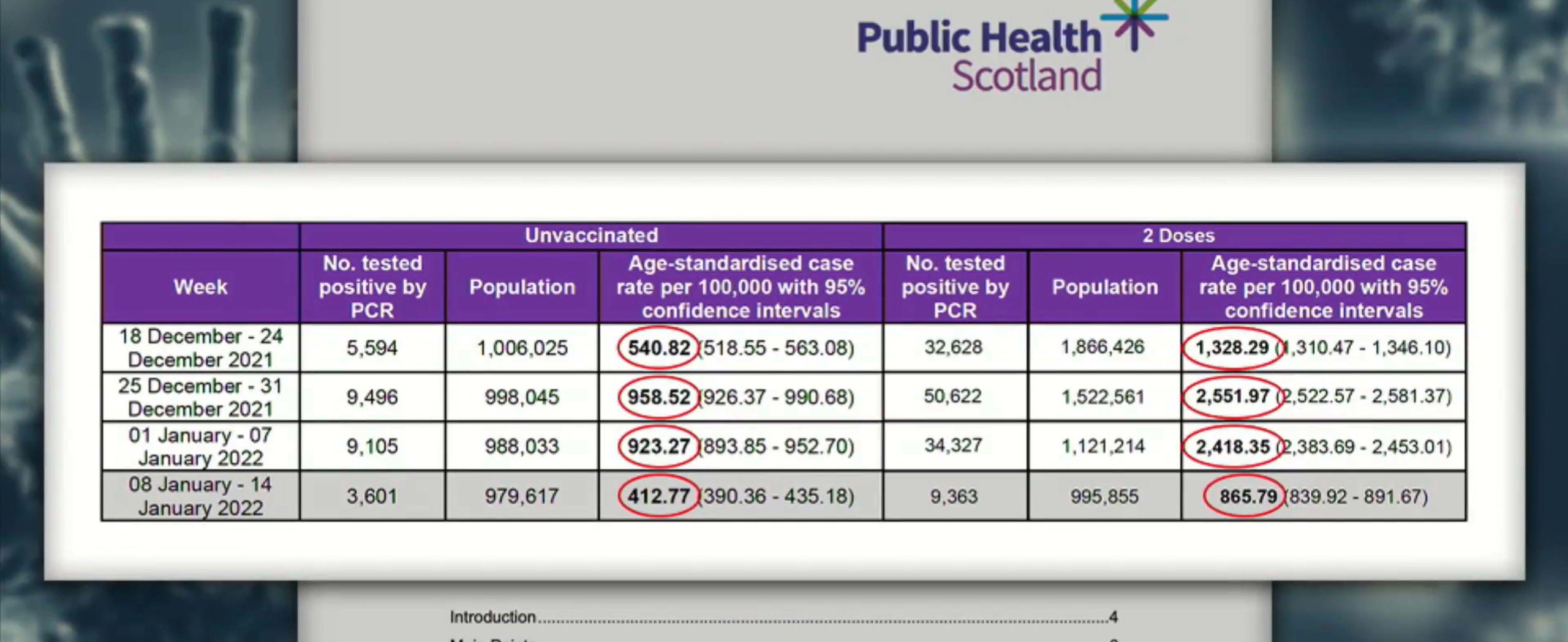
The two charts below compare the number of cases per 100,000 occurring in those vaccinated with either one or two doses to those not vaccinated. Public Health Scotland said they planned to stop publishing this information because anti-vax people could “misuse” it.
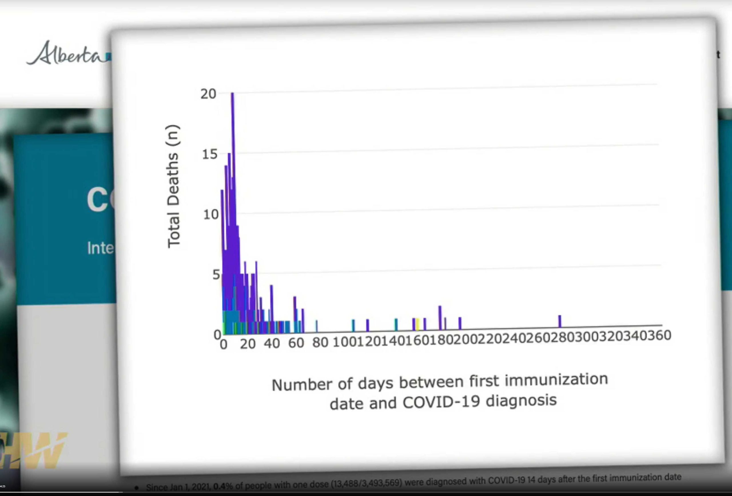
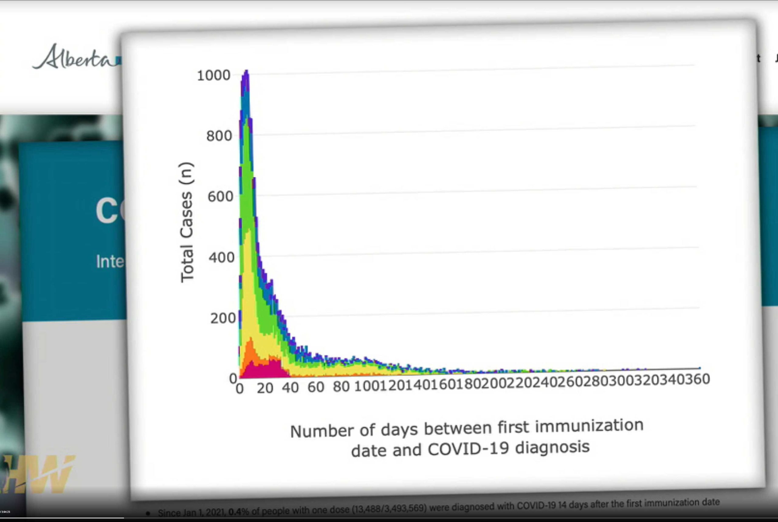
The three graphs below were published by the Ministry of Health in Alberta, Canada. They show a large spike in cases, hospitalizations, and deaths in the couple of weeks after the first Covid shot. These people would all be considered “unvaccinated” and may go quite a ways towards explaining the “pandemic of the unvaccinated.” When they realized what their graphs actually showed, the Ministry of Health took them down.

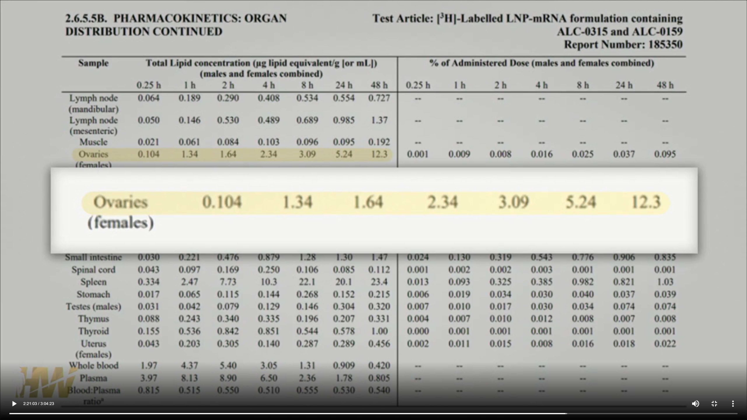
The chart below indicates where the vaccine dose ends up over a period of 48 hours. It seems quite a bit of it ends up in the ovaries. What this means for future generations is not known.
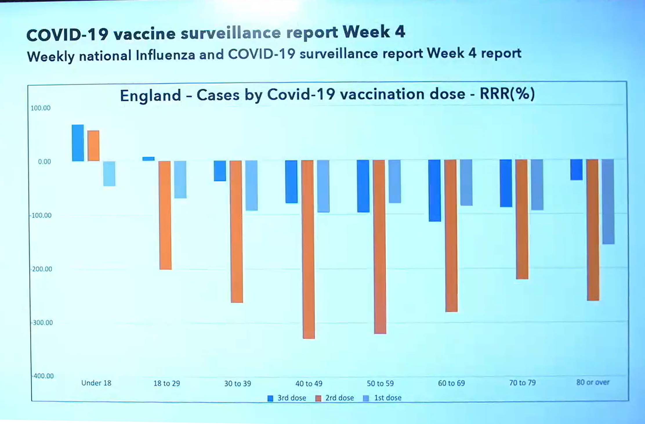
From the UK health department, early 2022: Comparison by age of vaccine efficacy by dose compared to zero line (likelihood of getting Covid if not vaccinated). Notice only the youngest (and most recently vaccinated) still have some positive efficacy.
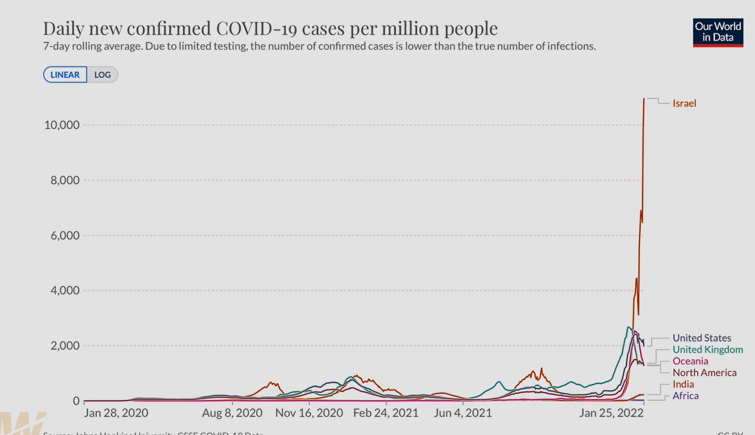
From Our World in Data, the number of cases per 7-days rolling average varies by country. And apparently, it looks like more cases the more vaccines the population has. Is this really how vaccines are supposed to work?
From Garcia-Cremades (2020) Full text Optimizing hydroxychloroquine dosing for patients with COVID-19: An integrative modeling approach for effective drug repurposing..
This was an effort to find the best dosing. BID = twice a day; TID = three times a day

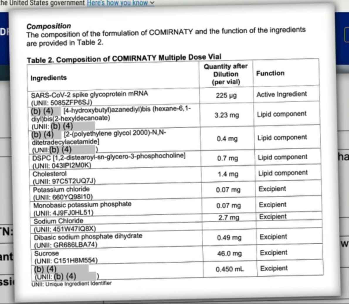
Below is the list of ingredients that Pfizer was required to list for Comirnaty. Notice that many are greyed out at least in part; the last one is totally greyed out. Pfizer said it is a “proprietary” ingredient which is a fancy word for “secret.” After being sued, they claim the ingredient is actually water. My question is, “What is IN that water?” As Anne of Green Gables said, his list leaves plenty of “scope for imagination.”
CDC study about immunity: https://www.cdc.gov/mmwr/volumes/71/wr/mm7104e1.htm?s_cid=mm7104e1_w
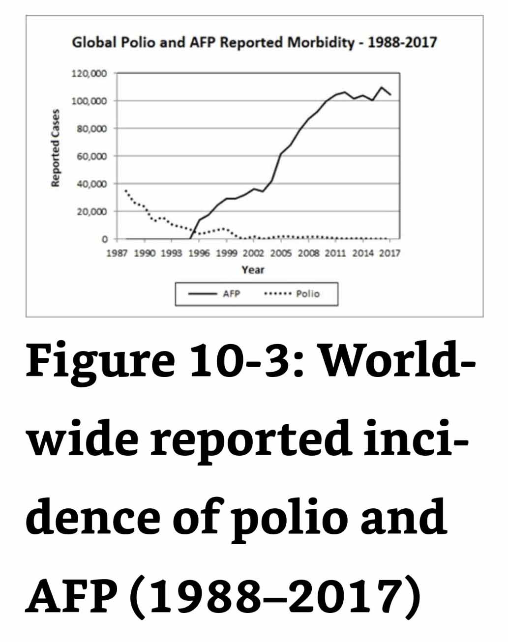
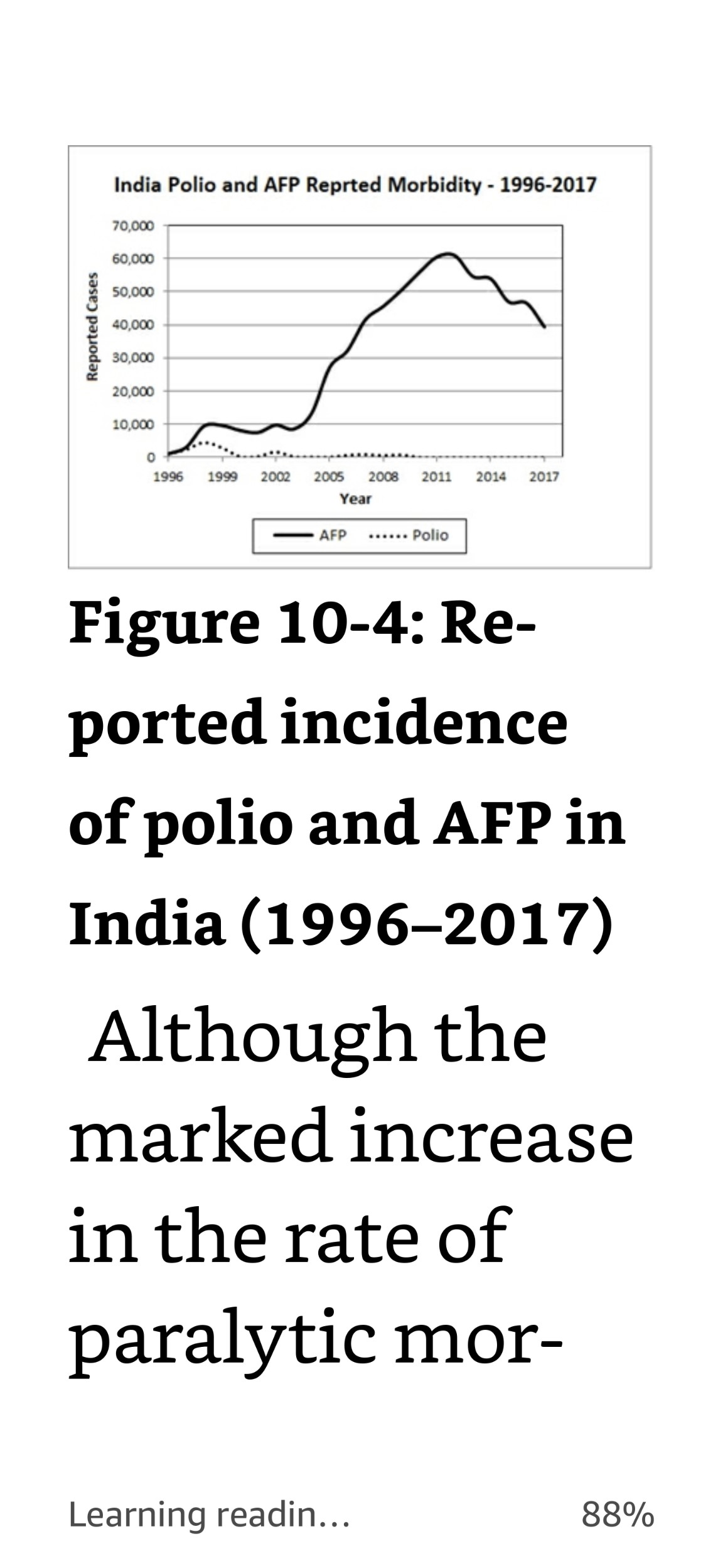
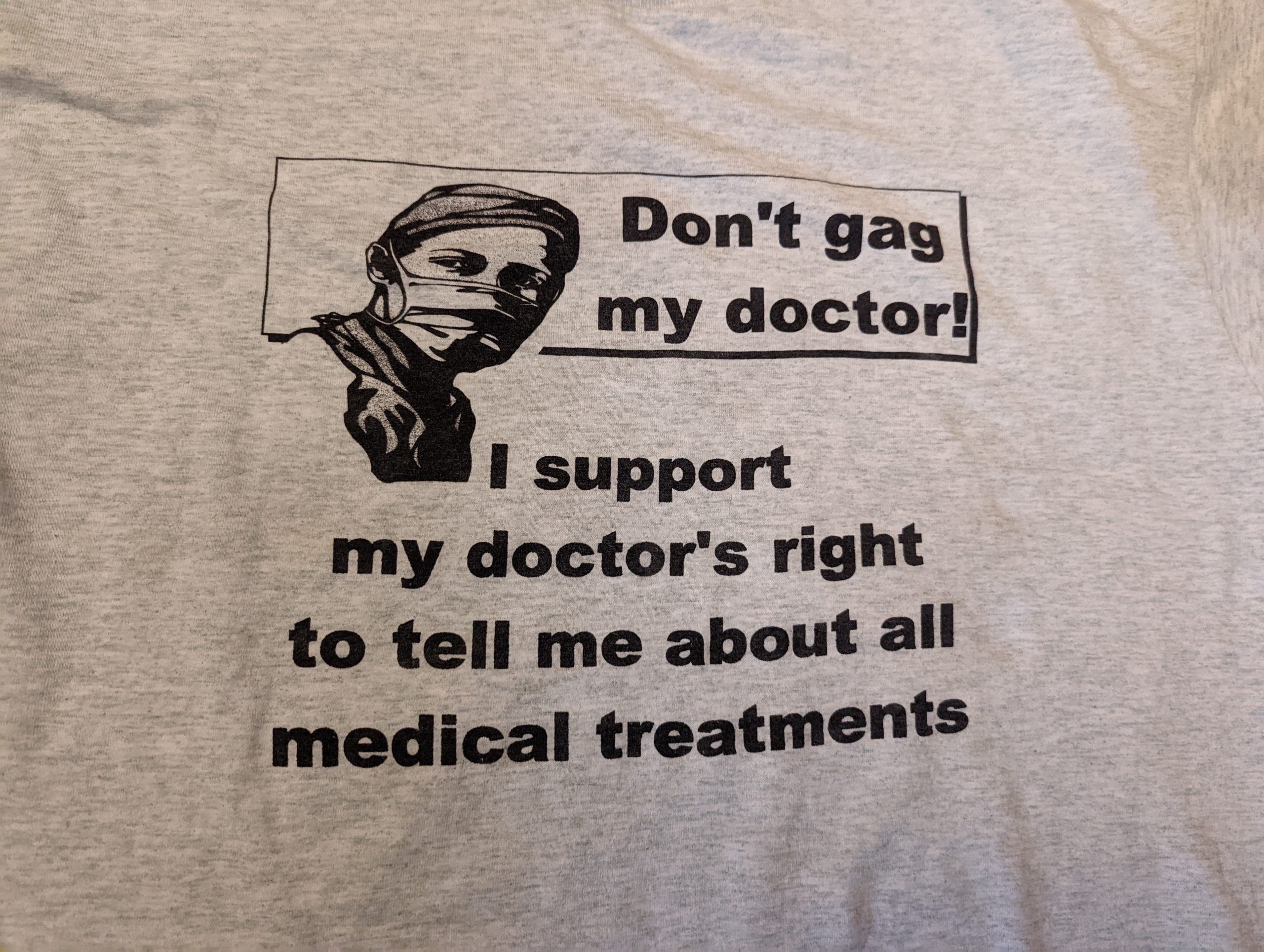
Other vaccines, since this question has been recently and repeatedly brought up:
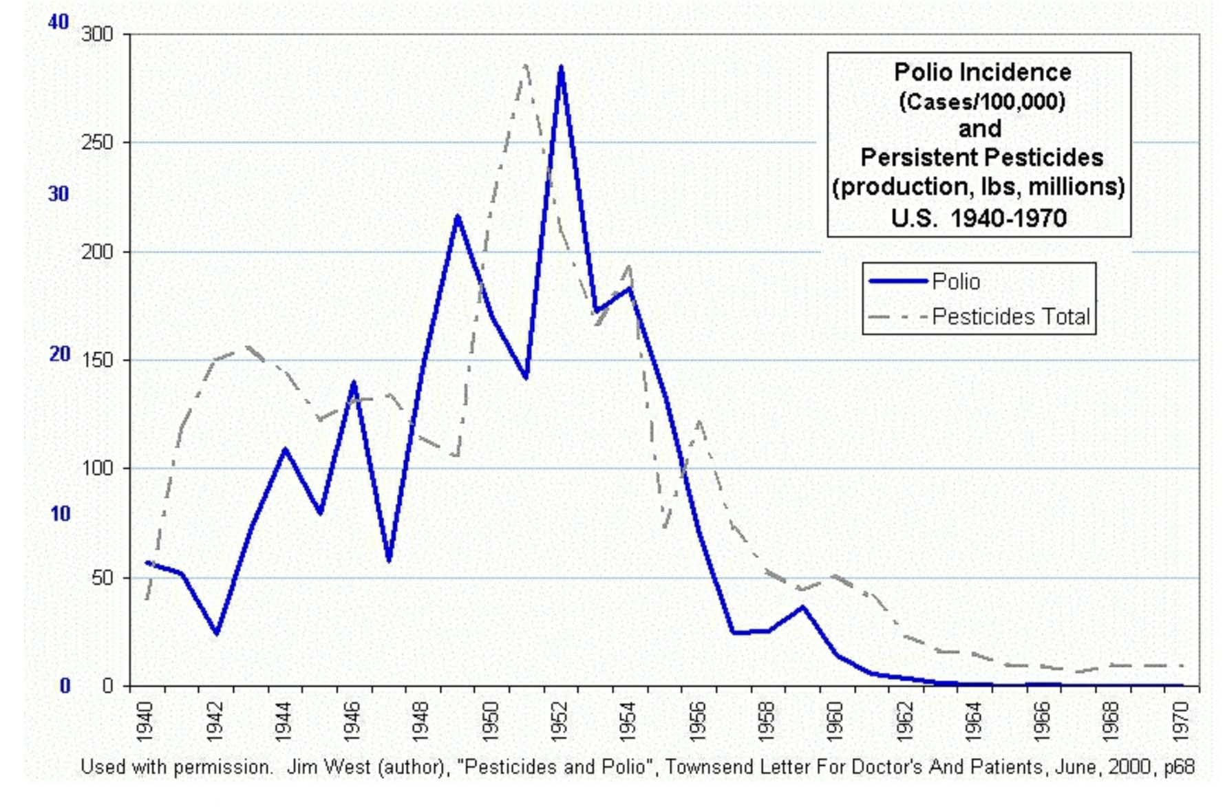
For those who believe that vaccines saved the day in the history of measles … well, it wasn’t quite the way you think. Mortality was at practically zero before the vaccines were ever introduced.